Monday, September 14, 2015

Prospective - Peyton Payne


This image represents “monumental” by showing the miniature elderly couple admiring the cigarette butt like it’s a monument.

 
 By trying to make the golf ball look like it is as big as the human, the image represents “exaggeration.”


This image shows a representation of “scale.” It is showing how big the object is compared to a human.


The “Last Supper” represents “golden mean” by bringing everything together and making the main point on Christ. 

Emphasis Madison Duncan


Emphasis gives prominence to part of a design. A focal point us a compositional device used to create emphasis. Both emphasis and focal point are used to attract attention and increase visual and conceptual impact.

Image 1 portrays emphasis by size because the focal point is the smaller dot


Image 2 demonstrates emphasis by converging lines to the areas where the lines meet

Image 3 provides emphasis by contrast between the difference of colors and shapes

Image 4 the focal point is the colorful shape

Image 5 emphasizes on the darker blue area where all the boats are heading towards

Lines

Geometric Line- lines that are crisp, precise and with a mathematically 


consistent curved
line- an implied connection between points
Implied Line- lines that suggests a position or shape of an object


Calligraphy- a flowing and expressive line that is personal as hand writing


Curved Line- line that bends in a continuous way without sharp angles


Rhythm and Movement

Rhythm and Movement
Using art elements to direct a viewer's eye along a path through the artwork, and/or to show movement, action and direction. Also, giving some elements the ability to be moved or move on their own, via internal or external power.

     Movement- In a still picture such as a painting or photograph, where nothing is actually moving, various strategies can be used to give the viewer a sense of movement and speed, or to move the viewer's eye through the work. These include lines, diagonals and unbalanced elements; blurring; placement; direction; and motion lines and afterimages.To create movement, the design should have a sense of flow in the picture, a sense of direction. A rhythm in the picture can also cause a movement.

Notice how the picture include the movement through many ways, such as blurring and the motion that the art carries.


Rhythm-
When motifs or elements are repeated, alternated, or otherwise arranged, the intervals between them or how they overlap can create rhythm and a sense of movement. In visual rhythm, design motifs become the beats. Rhythms can be broadly categorized as random, regular, alternating, flowing, and progressive.To create rhythm in the picture you need to have repetition of line, shape, color, or style in the picture or a combination of these things.


Three Flags by Jasper Johns


 Regular Rhythm - Like a heart or song with a steady beat, regular rhythm is created by a series of elements, often identical or similar, that are placed at regular or similar intervals, such as in grids. Simple regular rhythms, if overused, can be monotonous.


 Movement is the illusion of motion created by lines, shapes or color that cause the eye to move over the design along those shapes, where as rhythm is the regular repetition of lines, shapes, or color that creates a pattern to the overall design. A rhythm in the picture can also create a movement. For example the famous Starry Night painting by Van gogh, The picture shows movement by the unique painting of cloud/wind which seems to move from left to write, where as the same style of shape is used for stars, moon and the overall color gives a rhythm to the whole design.


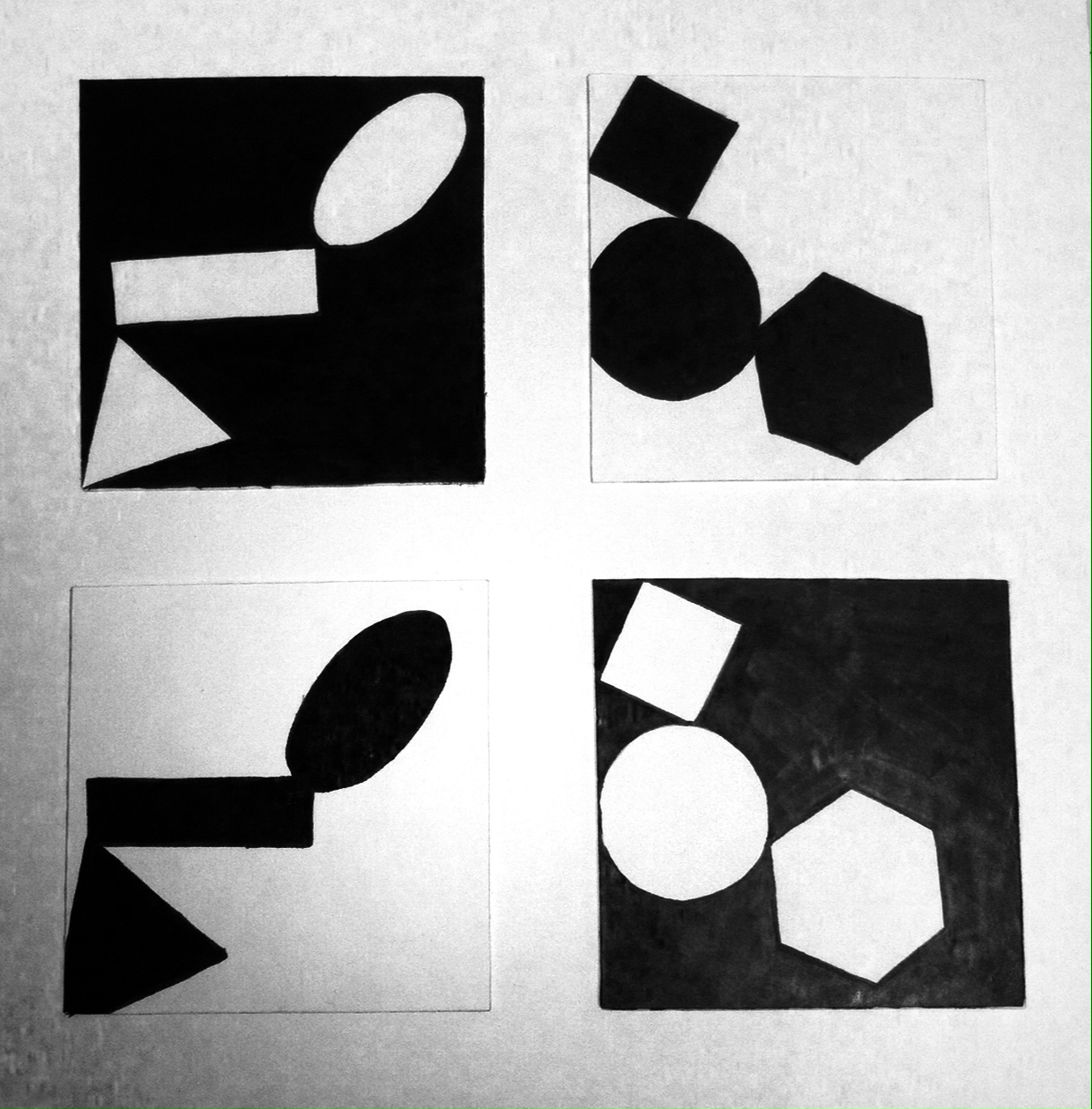
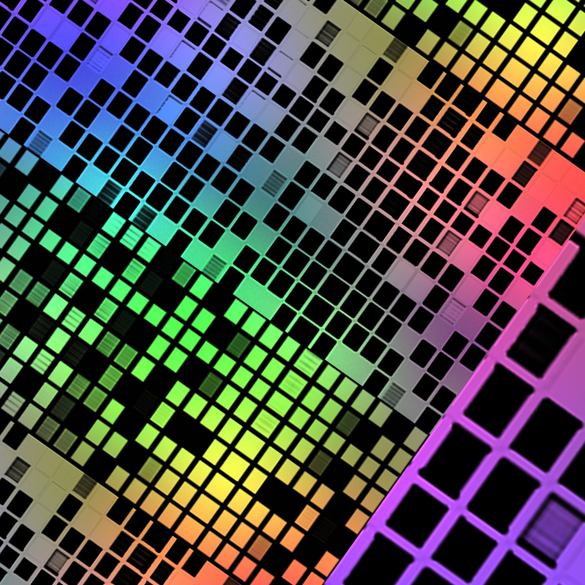
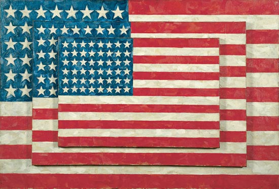
Another example of rhythm and movement.


Sources: http://flyeschool.com/content/movement, http://flyeschool.com/content/repetition-rhythm-and-pattern, http://abcofdesign.com/2010/03/difference-between-movement-and-rhythm.html

Texture

Texture

  1. In the visual artstexture is the perceived surface quality of a work of art. It is an element of two-dimensional and three-dimensional designs and is distinguished by its perceived visual and physical properties.
~Physical~


as you can see in the picture you can see the texture of the wood post and the metal chain wrapped around it along with the grass texture.

Everything has texture even drawings for example

~Visual~

Visual texture is the illusion of having physical texture. Every material and every support surface has its own visual texture and needs to be taken into consideration before creating a composition. As such, materials such as canvas and watercolor paper are considerably rougher than, for example, photo-quality computer paper and may not be best suited to creating a flat, smooth texture. Photography, drawings and paintings use visual texture both to portray their subject matter realistically and with interpretation. Texture in these media are generally created by the repetition of shape and line.

Light\Color\Value

Light:

Something that makes things visible or affords illumination


This is showing different value through light sources from different places. The shapes transform depending on where the light source is hitting the object.


Because there is light, there is also a shadow for each light source. Without light, everything would be black. No color would exist either because color is just the reflection of different light streams into your eyes. 


Color:

Color is the element of art that refers to reflected light. The color wheel is made up of three different types of colors - Primary, Secondary, and Tertiary. The light streams go in the same order of the rainbow, so it goes: Red, orange, yellow, green, blue, indigo, violet/


The primary colors are red, yellow, and blue.  They are called primary for a couple of reasons.  First, no two colors can be mixed to create a primary color. In other words, primary colors can only be created through the use of natural pigments.  Secondly, all other colors found on the color wheel can be created by mixing primary colors together.

Value:

Value deals with the lightness or darkness of a color.  Since we see objects and understand objects because of how dark or light they are, value is incredible important to art. Value deals directly to light.  We see things because light reflects off of objects and goes into our eyes.  Our mind processes the light and rationalizes what we are seeing.  Without light, we cannot see anything. In order to draw or paint in a way that creates an illusion of what we normally see, we must fully understand light and how it reacts on surfaces.  Value is the key to the illusion of light.  This is why value is so incredibly important to drawing and painting.

Lets Talk About Space

  1. Space
    Space is an area that an artist provides for a particular purpose. Space includes the background, foreground and middle ground, and refers to the distances or area(s) around, between, and within things. 

    Positive and Negative
    The area around positive shapes, the background, is negative space. A solid piece of sculpture occupies space, and makes the space around it come to life.
    Scale
    Scale refers to the size of an object (a whole) in relationship to another object (another whole). 
    Illusion of Space
    Illusion of space is something created by artists through their use of color, shadow and perspective. it gives the viewer the feeling that the painting has depth, rather than being the 2 dimensional surface that it is. 
    2D Space
    2D space refers to the flat surface region of a drawing/painting upon which one creates the artwork.  2D space is measured in two dimensions – width and height.
    3D Space
    3D space refers to the real space of an object/figure in an environment, as well as the seemingly real appearance of a form drawn/painted to create a sense of real-life illusion on a 2D space. 

Shape and Form

Concave/Convex: Creating images through drawing extrusions or recessions in surfaces through lines and shading, resulting in a 3D affect that can appear as either extruding or receding. 
Positive/Negative: the use of imagery to produce two images within the other, using the negative spacing within one image to produce a separate image. 
Organic: Creation of artwork incorporating the natural randomized flow found in nature. Such as tree branches or vines which have no symmetry, everything is different.
Pyramid:  Taking the shape of a pyramid as a solid object or one comprised or smaller pieces which make up the body of the image.

 Solid/Void: Solid and void are given shape, creating the illusion of an object possessing more mass than it truly does, usually resulting in hollow areas or recesses within the object.

Project 2


project 1& 2


Brittany Partello Project Two